By Nadja Sayej
In our rushed digital era shaped by the ongoing scroll of our screens, artist-designer Coco Shiya Yuan offers a counter-narrative.
The New York-based, Chinese graphic designer and visual artist, originally from Melbourne, has an interdisciplinary practice that spans graphic design, art books, writing, installation art and creative coding.
Yuan’s practice reflects an ongoing interest in narrative, materiality and the human touch within design processes. In a design world often influenced by fleeting trends, her commitment to experimental processes, physical (analog) engagement and the nuanced interplay of type and image presents a distinct alternative.
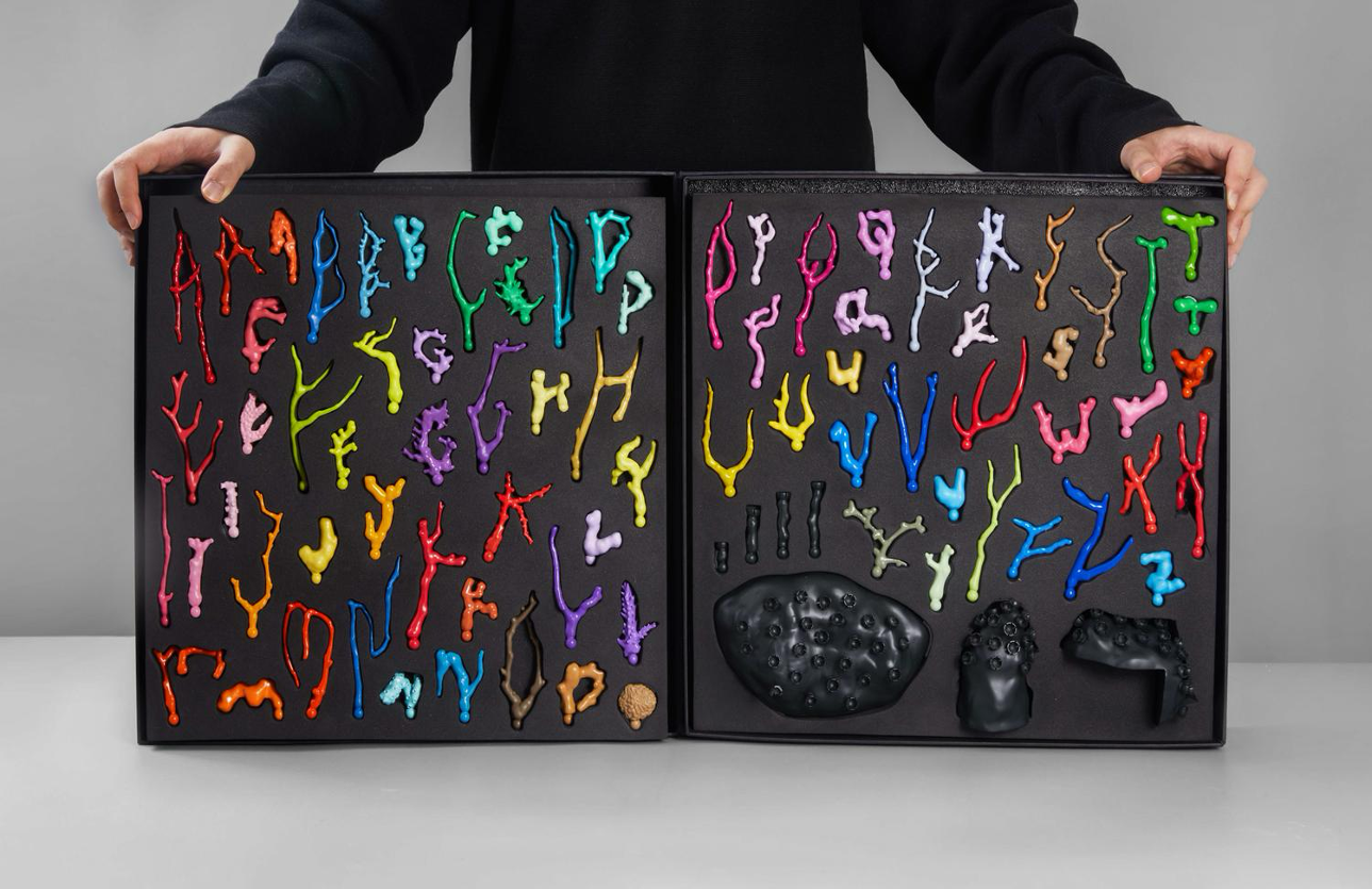
One of her projects, the “Coral Typography Tool,” is a typographic system inspired by coral reef structures. Made of 3D printed resin, it features a set of rainbow-hued letters modelled in zBrush and is designed to be physically arrangeable. The tool kit provides three variations for every letter in the alphabet, and has three base forms to play with.
The project began with an interest in coral reefs and their organic, irregular structures. After studying different species and forms, Yuan translated them into letterforms, modelling a full alphabet in 3D software and eventually producing the letters as physical objects.
This project, the “Coral Typography Tool,” has received significant recognition, including a Certificate of Typographic Excellence at the Type Directors Club competition (TDC69) in 2023. The competition is an international programme recognising excellence in typography, with a limited number of projects awarded each year.
Just as Yuan translates the intricate structures of coral reefs into three-dimensional, interchangeable letterforms, the decision to develop this as a physical system was key: “I wanted the letters to feel closer to actual coral structures, rather than flattened versions reduced to their outlines,” she explains.
By moving type off the screen into space, the work introduces a more tactile approach to typography, where spacing, composition and dimension are negotiated by hand. The colour and scale of the tool also lend a playful, toy-like quality, contributing to a more open and accessible process of arranging letters, including for those without a design background.
Her design methodologies have been recognised by prestigious awards and resulted in sophisticated collaborations, reflecting an approach that extends beyond standardised design processes. Rather than establishing a fixed visual style, projects such as the “Coral Typography Tool” point to a way of working that prioritises specificity and material engagement.
Through her work, Yuan approaches design not only as a service, or a function, but as a form of storytelling and world-building that echoes the intricate beauty of contemporary fairy tales. With an MFA in Graphic Design from the Yale School of Art, Yuan’s distinctive design approach delves into fantasy and “fictioning,” an approach which can be seen as an experimental process or a discernible “touch of the hand” to construct narrative worlds where design, text and objects intertwine.
Much of Yuan’s work explores the relationship between typography and image, and how the two interact in shaping meaning and perception.
Her process often begins with a structural decision: whether a project should be primarily text-driven, image-driven or a harmonious blend of both. This initial determination then informs the overall development of the design.
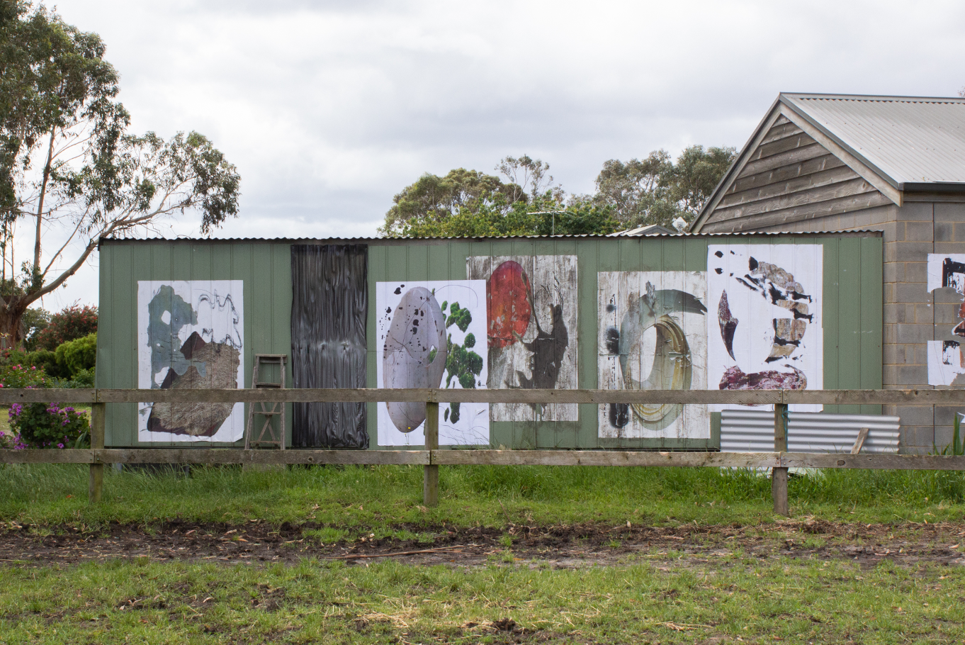
When a project leans heavily on visual cues, Yuan often takes on the role of image maker herself, demonstrating a holistic command over her creative output. These images are sometimes constructed from scratch and sometimes from existing images, but are consistently reworked through processes of translation. This process can involve everything from drawing based on observation or source material to constructing elaborate props and sets.
These physical creations are then photographed, generating new images that may undergo further layers of translation and recontextualization, through which complex narratives are worked into the image. This hands-on, multi-stage approach ensures that every visual element carries the imprint of her design intent, extending beyond purely digital processes.
For Yuan, typography possesses an inherent visual power, capable of standing alone. “When the typography is strong enough, a text-only layout can also operate as an image on its own, carrying form and narrative,” she explains.
Yuan’s approach to type communicates not just semantic meaning, but also aesthetic and emotional resonance. This is part of what distinguishes Yuan’s work within contemporary design practice, treating design as a method of constructing worlds where visual elements and stories intimately intertwine.
This approach moves against what she identifies as an era increasingly dominated by digital design, where many processes prioritise speed, standardisation and screen-based formats. “I’m not interested in making something quickly or making something that looks the same across projects,” Yuan said.
Her design practice reflects a resistance to homogenization, prioritizing instead “where each project is shaped by its own material and context.” This emphasis on specificity often manifests through physical experimentation. Yuan’s process frequently begins with “analog tools to test ideas through drawing, sketching, or building small-scale objects, before moving into a more resolved design.” Even when the final output is destined for digital consumption, these foundational, haptic stages inform both the underlying structure and the superficial texture of the work.
She has worked as a graphic designer for the Andy Warhol-founded magazine Interview Magazine, where she worked on a recent issue featuring a cover story with Zendaya and Robert Pattinson, among other issues, and is currently working as a graphic designer on a photobook with artist and photographer Malerie Marder.
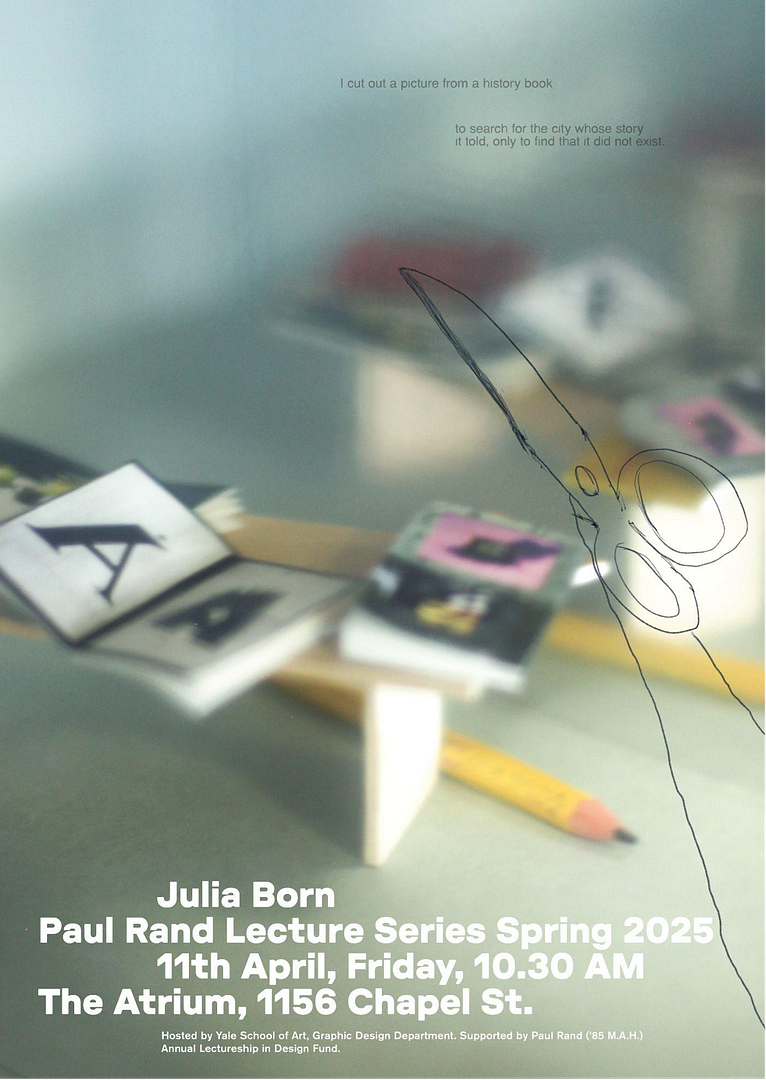
Alongside this, Yuan’s work also extends to posters, a medium that demands immediate impact and clear communication. When asked what constitutes a good poster, she emphasises the importance of capturing attention swiftly with a strong and clear gesture, rather than multiple competing elements.
In her view, a well-designed poster also relies on a clear hierarchy, ensuring that the most vital information is instantly visible. In balancing type and image, her approach is driven by intention: “what matters to me is deciding which carries the main message, and keeping the other element restrained enough to support it rather than compete.”
Whether the image leads the visual narrative or the type carries the primary weight, the relationship is treated as a deliberate one. Yuan tends to work with relatively simple typographic choices, allowing their form to shape the visual impact, rather than relying on overly decorative styles. Yet, she dispels the notion that simplicity equates to lack of complexity, acknowledging that a poster doesn’t necessarily have to be simple. “Type and image can be dense, in tension or even chaotic, and still work, as long as the composition holds together and the hierarchy remains legible,” she said.
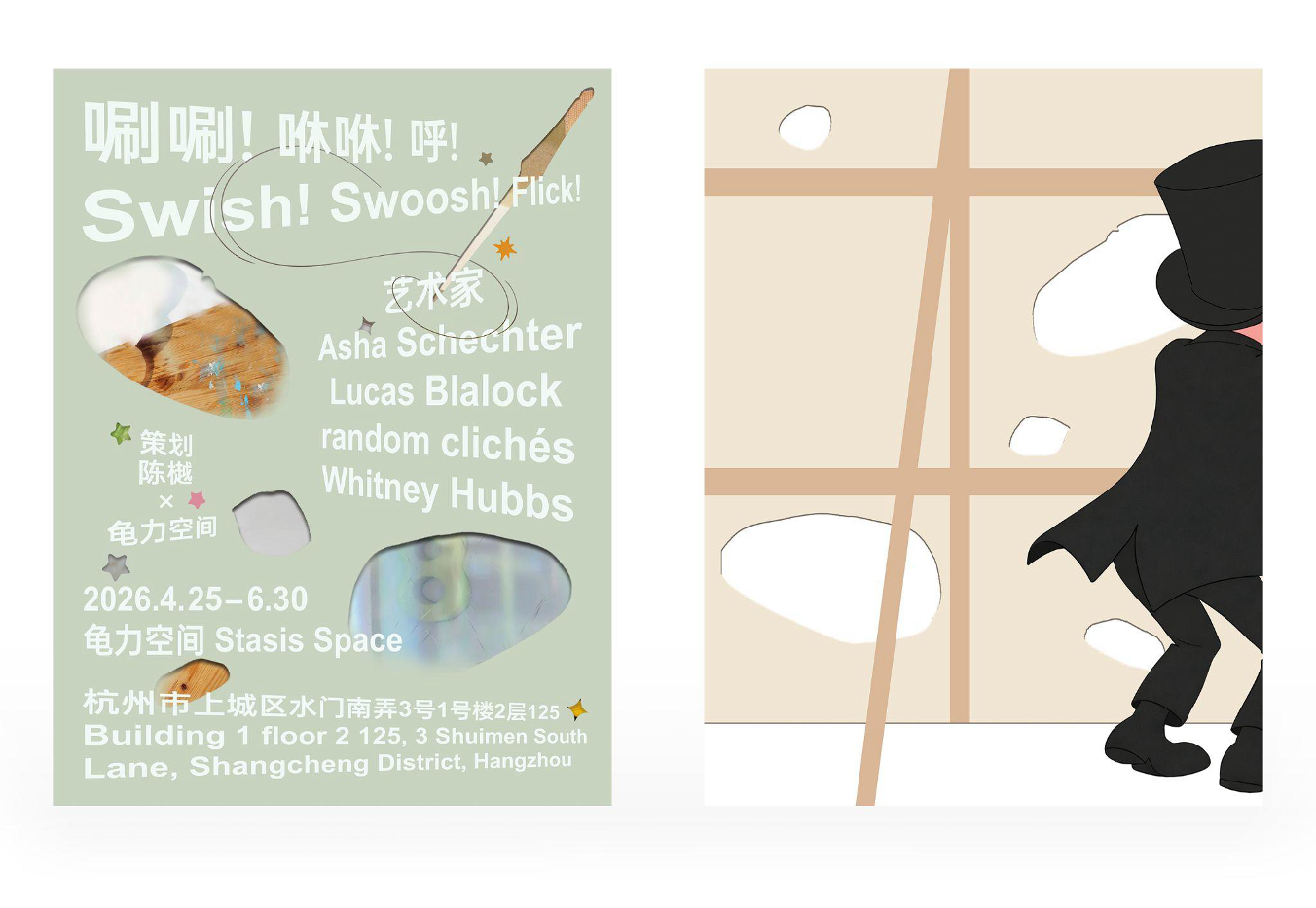
Yuan recently collaborated with designer June Lihua Yu on the visual identity for the “Swish! Swoosh! Flick!” group exhibition in Hangzhou, China. Currently on view at Stasis Space, a celebrated independent art space, the exhibition draws on the concept of “magic” as a form of manipulation, mirroring the practices of the featured artists, including Lucas Blalock, Whitney Hubbs, and Asha Schechter.
For the design and identity of the show, Yuan approached the project through a fictional narrative around a magician working behind the scenes, brought to life through a series of illustrations across the poster and catalog.
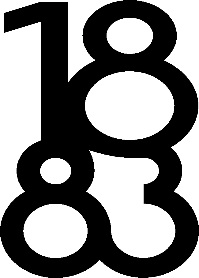
On the front of the poster, typography takes center stage, beginning with a straightforward typographic foundation using Arial Bold and Oppo Sans Medium, which is then stretched and displaced to create a sense of depth and spatial tension in relation to the graphic layer underneath. This treatment introduces a sense of movement, giving the typography a more dynamic presence across the composition.
The reverse side of the poster further unravels the narrative, offering a purely illustrative glimpse of the magician behind the scenes, reinforcing the exhibition’s magical theme and Yuan’s commitment to world-building through design.
“I was interested in building a narrative that unfolds across the whole identity, where each element reveals a different part of the story,” Yuan said, pointing to an approach that unfolds across multiple encounters, rather than in a single moment.
Images courtesy of Coco Yuan