
Design conversations about collectible objects usually center on shape and color first, with texture treated as an afterthought. That ordering deserves to be questioned, because texture is often the first thing a person notices when they actually hold an object in their hands, and in a category built entirely around touch, it arguably deserves to be the starting point rather than the finishing detail.
Why Texture Is the Real Starting Point for Tactile Design
Squishy toys are a useful case study here precisely because touch is the entire premise of the category. Nobody buys a squishy to look at from across a room. The whole point is contact, so the surface finish isn’t decoration in the traditional sense, it’s the core of the product experience. This is part of why texture-driven variations within a single collection tend to generate such distinct reactions from buyers, even when the underlying shape stays exactly the same across versions.
The Visual Appeal of Transparent Finishes
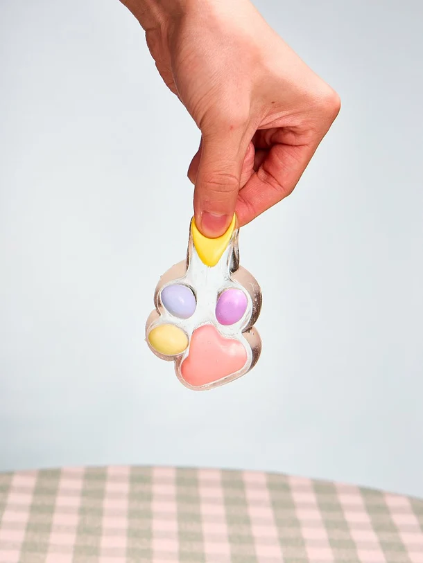
Transparent finishes represent one clear direction this can take. There’s something visually striking about being able to see partway into an object that’s normally opaque, and it changes the relationship between looking and touching in a way that opaque designs don’t. A clear and transparent squishy invites a different kind of attention than a solid-colored version of the same shape would. You end up examining it rather than just glancing at it, turning it in the light, noticing how the internal structure looks different from various angles. That’s a genuinely different design language from most novelty objects, which tend to rely entirely on external color and shape.
The Comfort of a Soft, Flocked Finish
At the opposite end of the texture spectrum sits flocked or velvet-style finishing, which does the reverse job. Instead of drawing the eye inward, it emphasizes surface texture over anything else. A soft, fuzzy exterior changes the tactile experience considerably compared to a smooth or rubbery finish, and for a lot of people that softness reads as more comforting, closer to a plush toy than a typical rubber novelty item. A well-executed soft flocked squishy collection demonstrates how much a single design choice, the surface coating, can shift an entire product’s identity without changing the underlying shape at all.
Two Opposite Design Directions, One Successful Category
What’s interesting from a design standpoint is how these two directions, transparent and flocked, sit at almost opposite ends of what a texture can communicate. One is about visual depth and a slightly futuristic, glassy quality. The other is about warmth, softness, and something closer to a comfort object. Both work within the same broad squishy category, which says something about how much room texture alone gives designers to create genuinely different emotional experiences from a similar base shape.
Texture as a Design Lever Beyond Tactile Toys
This kind of texture-first thinking isn’t unique to squishies, of course. Fashion and product design have used surface finish as a primary design lever for a long time, matte versus glossy, smooth versus textured, structured versus soft. What makes it particularly relevant in a tactile toy category is that the finish isn’t just aesthetic, it’s functional in a way that matters immediately upon contact. A garment’s texture matters when you’re wearing it. A squishy’s texture matters the instant you pick it up, which puts more pressure on getting the finish right than in categories where texture is a secondary consideration.
Collectors Develop Real Preferences by Finish, Not Just Shape
Collectors seem to respond to this variety in a genuine way, often gravitating toward one finish type over another based on personal preference rather than simply collecting every version available. Some people consistently prefer the visual novelty of transparent designs, while others are drawn almost entirely to soft, plush-adjacent textures. That kind of preference split suggests texture isn’t a minor variable in this category, it’s closer to a core design axis on par with color or shape, deserving the same level of intentional attention from anyone designing within this space.
A Broader Lesson for Tactile Product Design
There’s a broader lesson here for anyone thinking about tactile product design generally. It’s tempting to treat surface finish as the last decision in a design process, something applied after the more important choices about shape and color have already been locked in. A category built entirely around touch makes a strong case for reversing that order, starting with how something should feel in the hand and letting shape and color follow from there. Designers who treat texture as an equal partner to shape from the very start of a project tend to produce pieces that feel more intentional and less like an afterthought bolted onto an existing mold.
How Manufacturing Constraints Shape Texture Choices
Achieving a specific texture at scale is harder than it looks from the outside, and it’s worth understanding why some finishes appear more often than others across the broader market. A transparent finish requires a different base material and molding process than an opaque one, since clarity depends on minimizing internal imperfections that would normally be hidden by pigment. Flocking, meanwhile, involves an entirely separate application step after the base shape is formed, adding fine fibers to the surface in a way that has to be consistent across every unit in a production run. Both processes cost more and take more care than a standard single-material, single-color piece, which is part of why texture-driven collections tend to command a bit more attention and, often, a slightly higher price point than simpler designs.
Mixing Textures Within a Single Collection
Some of the more interesting design work in this space comes from collections that mix texture types deliberately rather than committing to just one finish across an entire line. Pairing a smooth, glossy piece next to a flocked one on the same shelf creates a kind of contrast that neither would achieve fully on its own, giving a collector’s display more visual and tactile range. This mixed approach also gives buyers with different texture preferences a reason to explore the same broader collection rather than sticking to just one corner of it.
What Buyers Should Pay Attention to Before Choosing a Finish
For anyone shopping within this category with a specific texture preference in mind, it helps to look closely at product photos and descriptions rather than assuming every piece in a themed collection shares the same finish. Brands increasingly mix transparent, flocked, and standard matte or glossy options within the same broader product line, which means two pieces that look similar in a thumbnail image can feel completely different once they actually arrive. Reading the material description carefully, or reaching out to ask directly if it isn’t clear, avoids the disappointment of receiving a piece with a finish that doesn’t match what a buyer had pictured in their head.
Final Thoughts
Whether the direction is glassy and transparent or soft and fuzzy, texture turns out to be doing far more design work in this category than it usually gets credit for. It’s the difference between an object you look at and one you actually want to hold.