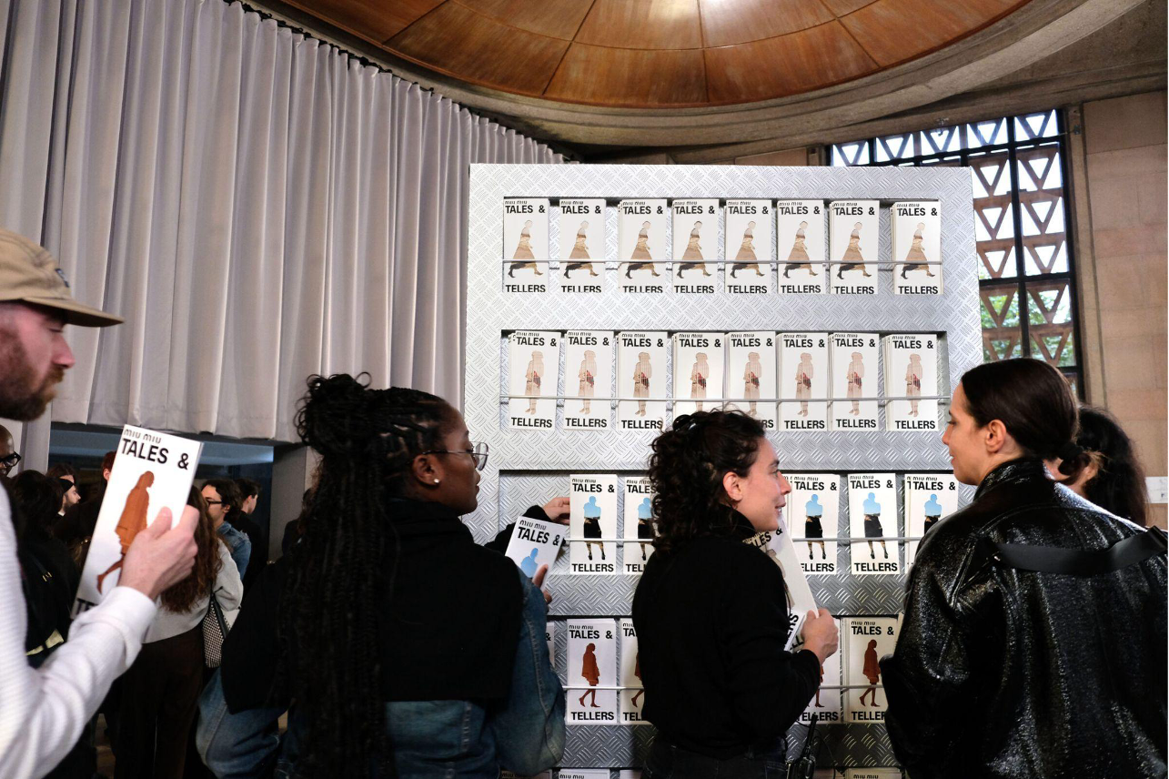
When Miu Miu recently premiered Tales & Tellers during Art Basel Paris, the first showing of the project, the Italian fashion house did not simply hang banners inside a conventional gallery. It took over the Palais d’Iéna in Paris’s 16th arrondissement, the monumental late-1930s reinforced concrete landmark designed by architect Auguste Perret that houses France’s Conseil Économique, Social et Environnemental. Across the building’s classical proportions and colonnades, posters, printed pamphlets and stark black character silhouettes invited passersby into an archive of female-directed cinema and runway interventions.
Behind that cohesive visual system was a multidisciplinary team at the acclaimed New York design agency 2×4, working under studio director Michael Rock. As a graphic designer on the project, Genie Wu contributed to shaping how Miu Miu’s cinematic and artistic universe translated from screen and stage to print, the urban landscape and online.
Spanning both the 28th chapter of the Miu Miu Women’s Tales film series and Tales & Tellers, first shown in Paris and later in New York, the assignment required balancing high-fashion polish with the raw narrative texture of independent art. Wu helped translate Laura Citarella’s Argentine mystery film El Affaire Miu Miu and Goshka Macuga’s Palais d’Iéna exhibition into street-level visual storytelling.
Rather than functioning as solo authorship, both campaigns were built through close studio collaboration. For El Affaire Miu Miu, the 28th installment of Miu Miu Women’s Tales, Wu worked alongside the 2×4 branding team to craft visual materials for the short film directed by Citarella. Following its premiere in the Giornate degli Autori section at the Venice Film Festival and then its global release on MUBI, the film presented a deliberately enigmatic premise. Set in the Argentine Pampas around Trenque Lauquen, Citarella’s story follows an Italian model who vanishes during a Latin American fashion shoot, leaving a team of local female detectives to piece together her disappearance through clues embedded in her Miu Miu wardrobe and the surrounding landscape.
To capture that off-kilter noir atmosphere without reducing the campaign to a standard luxury advertisement, Wu and the team began with early footage from the film.
“We had a chance to see a little part of the film and it’s a mysterious story,” Wu says. “The high-contrast serif typeface evokes sophistication, timeless elegance, and cinematic drama. It creates a refined yet commanding presence, reminiscent of classic fashion editorials.”
As she explains: “When paired with atmospheric imagery, the typography establishes a sense of mystery, sensuality and unconventional femininity. It doesn’t just make the audience feel that something is luxurious; it makes them feel as though they are entering a mysterious, sophisticated fashion film.”
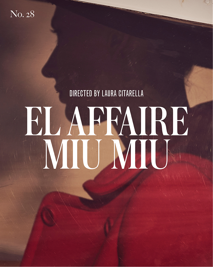
That tension between this editorial restraint and narrative intrigue guided the team’s choices around image selection, typography and text. Instead of relying on crisp, studio-lit lookbook portraits, the layouts leaned into muted warmth, film grain and shadow.
“What makes the design of EL AFFAIRE MIU MIU stand out is the way it combines the elegance of classic cinema with a more mysterious and unconventional feel,” says Wu.
“The overall art direction also feels more like a film, rather than a typical fashion campaign,” she adds. “The warm, muted colors, grainy textures, dramatic shadows, and layered photography create a nostalgic and slightly mysterious atmosphere. While the typography feels polished and timeless, the imagery adds a sense of rawness and emotion.”
It is this balance that gives the design its impact. “It reflects Miu Miu’s approach to femininity, which is often elegant but never too conventional,” notes Wu. “There is a subtle sense of rebellion beneath the polished aesthetic. Rather than simply presenting a fashion brand, the visual identity draws the audience into the mood and world of the film.”
If El Affaire Miu Miu demanded the intimacy of a theatrical poster, Miu Miu Tales & Tellers called for an elevated, curatorial identity. Conceived by interdisciplinary artist Goshka Macuga and curated by Elvira Dyangani Ose, director of the Barcelona Museum of Contemporary Art, the exhibition brought together every artistic intervention from past Miu Miu runway shows alongside characters from the Women’s Tales film archive. Actors reenacted those film characters live under the movement direction of Macuga and theater and opera director Fabio Cherstich. Following its Paris debut at the Palais d’Iéna, the project then traveled to New York City. The Paris and New York presentations of Tales & Tellers received coverage in prominent international publications, including The New York Times, AnOther Magazine, Numéro Berlin, and L’Officiel USA.
Within 2×4’s collaborative framework, Wu worked closely with Rock and the broader branding and design teams to develop the primary visual language, printed ephemera and event giveaways for Tales & Tellers, ensuring every physical and environmental element felt unified.
“Working as part of 2×4’s branding team, Wu contributed to the development and execution of the visual identity for Miu Miu Tales & Tellers, including its primary visual language, printed materials, and event giveaways,” Wu notes.
“Together, we collaborated across disciplines to develop and refine design elements that aligned with Miu Miu’s brand identity while maintaining a cohesive visual experience across physical, environmental, and printed touchpoints.”
One of the campaign’s most recognizable graphic devices emerged from a collective decision to place the female protagonists directly at the center of the identity through custom silhouette cutouts paired with film stills.
“The silhouette cutout was a way to put the women at the center of the visual identity,” says Wu. “Since Miu Miu Women’s Tales gives female filmmakers a platform to tell stories from their own perspectives, we wanted the campaign to highlight the women and characters behind each film.”
“The series explores different aspects of being a woman, from beauty and vanity to independence, desire, vulnerability, and identity,” she explains. “We felt the silhouette was a simple but effective way to represent each main actress while leaving room for the audience to imagine who she was and become curious about her story.”
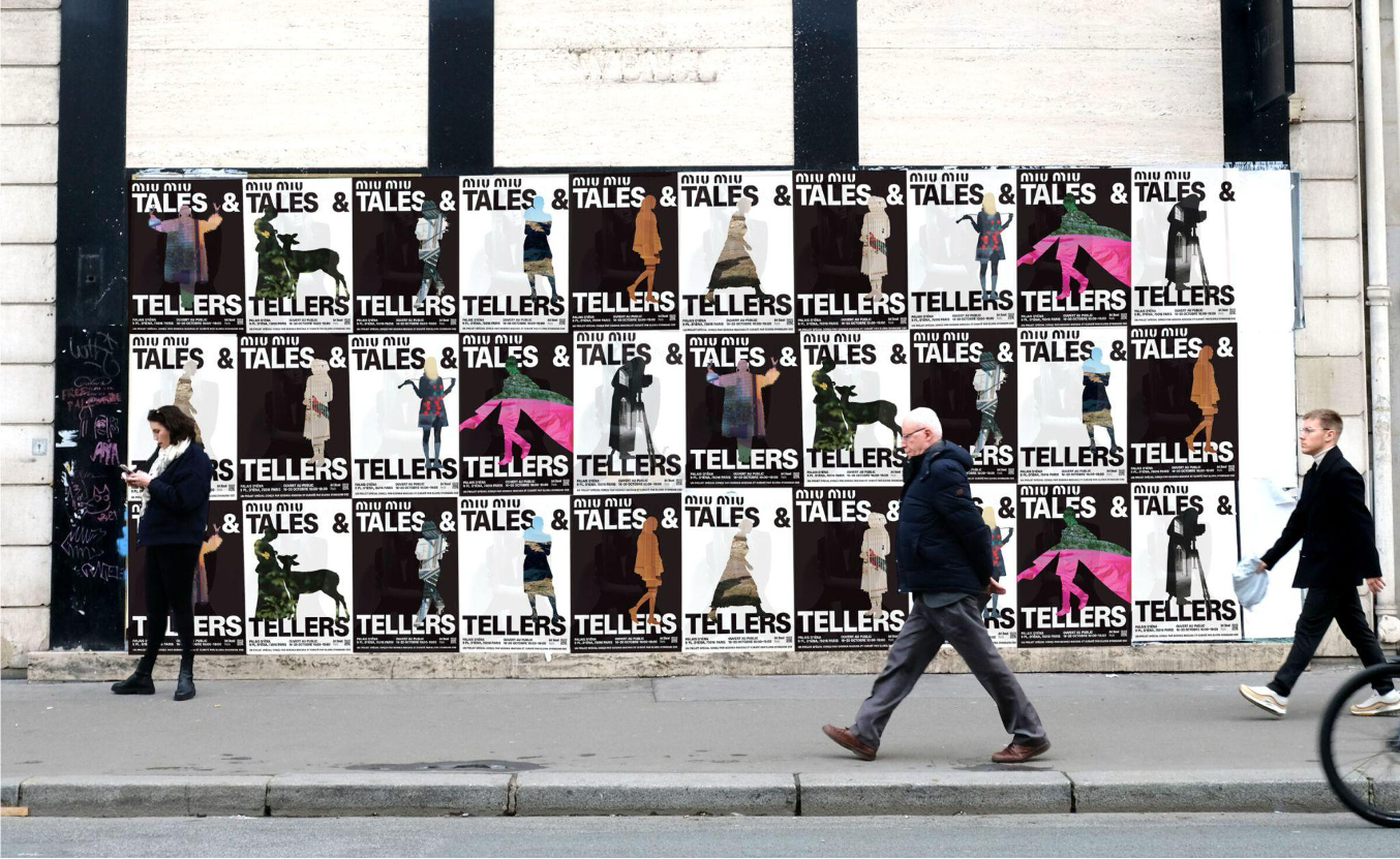
The team also incorporated stills from each film into the design layouts, giving audiences a glimpse into the narrative and atmosphere of each chapter. “This combination of the cutout silhouette and film imagery allowed us to introduce each character, while giving every film its own visual identity,” explains Wu. “Ultimately, the idea was to make the campaign feel less like traditional fashion advertising and more like an invitation to discover the women, characters, and stories behind each series of Miu Miu Women’s Tales.”
According to The New York Times, the Paris exhibition saw over 11,000 visitors in five days. Wu executed the majority of those character silhouette cutouts, working in close dialogue with the team and director so each outline retained the specificity of the original film frame rather than flattening into generic clip art.
Wu worked on most of the character silhouette cutouts for the first exhibition in Paris. “I collaborated closely with the team and the director to make sure each silhouette captured the character’s personality and communicated the story as accurately as possible,” she said. “We paid a lot of attention to the small details because we wanted each silhouette to feel recognizable and tell part of the story on its own.”
In one instance, the team looked closely at details like hand gestures, high heels, the texture of fashion items, fabric movement and other compositional elements to help guide their design approach. “These details might seem small, but they were absolutely crucial in capturing the characters and the atmosphere of each film,” she said. “We wanted to preserve as much of the original details as possible, rather than simplifying the silhouettes too much, so the audience could still recognize the characters and get a sense of their stories just by looking at them.”
Beyond print posters and exhibition graphics, the campaign also required a seamless digital front door. Because Tales & Tellers was open to the general public, Wu worked on the user experience design for the event registration website, a task that tested how editorial aesthetics hold up under practical constraints.
“The biggest challenge was designing the registration page for the public event, since it was open to everyone. There were a lot of different scenarios I had to consider when thinking through the user experience. For example, how people would navigate the registration process, how to organize the information, and how to integrate the campaign’s key visuals into the website without making the page feel too crowded,” Wu says.
“I also had to think about the information hierarchy and make sure everything was clear and easy to follow, so visitors could understand what they needed to do at each step. Another important consideration was making sure the design worked well across both desktop and mobile, since the layout and user experience needed to adapt to different screen sizes. There were many small details and possibilities to think through, but the main goal was to create a page that felt visually consistent with the campaign while still being functional and easy for everyone to use.”
Seeing the finished system roll out across street posters, pamphlets, and advertisements in both Paris and New York underscored why cross-disciplinary cultural design remains central to Wu’s practice. “This project was meaningful because it was more than just creating visuals for a fashion brand; Miu Miu Women’s Tales gives female filmmakers a platform to tell their own stories and explore different perspectives on women and identity,” she said.
Seeing the campaign come to life across major urban hubs like Paris and New York City through street posters, pamphlets and advertisements, was especially rewarding to the graphic designer, as well.
For Wu, the convergence of cinema, fashion, and graphic design proved most satisfying when visual craft served a broader cultural conversation. “Design is not only about making something visually appealing, but also about finding the right way to communicate an idea and connect with an audience,” she says. “Being part of a project that celebrates women’s stories and gives them more visibility made the experience even more meaningful to me.”
Words: Tom Oakley
Photos: Courtesy of 2×4