In the world of high fashion, spectacle is often the default. But for designer Ingrid Schmaedecke, the most powerful statements are sometimes made not with extravagance, but with intelligent restraint. This philosophy was put to the test in her work on Pradasphere II, a landmark traveling exhibition that chronicled the history of the iconic Italian house from 1913 to the present day. The project, which recently earned accolades from both design and architecture institutions, serves as a compelling case study in how environmental graphics can elevate a brand’s narrative without overpowering it.
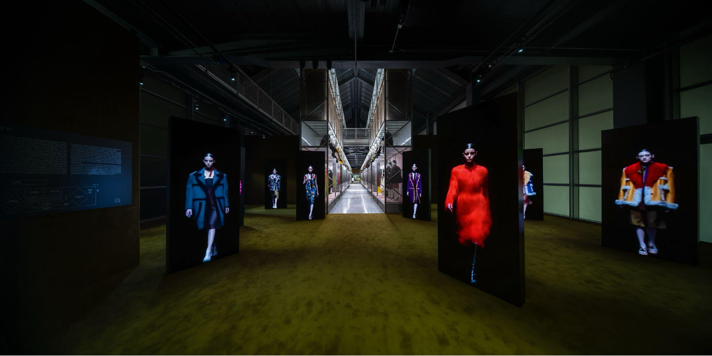
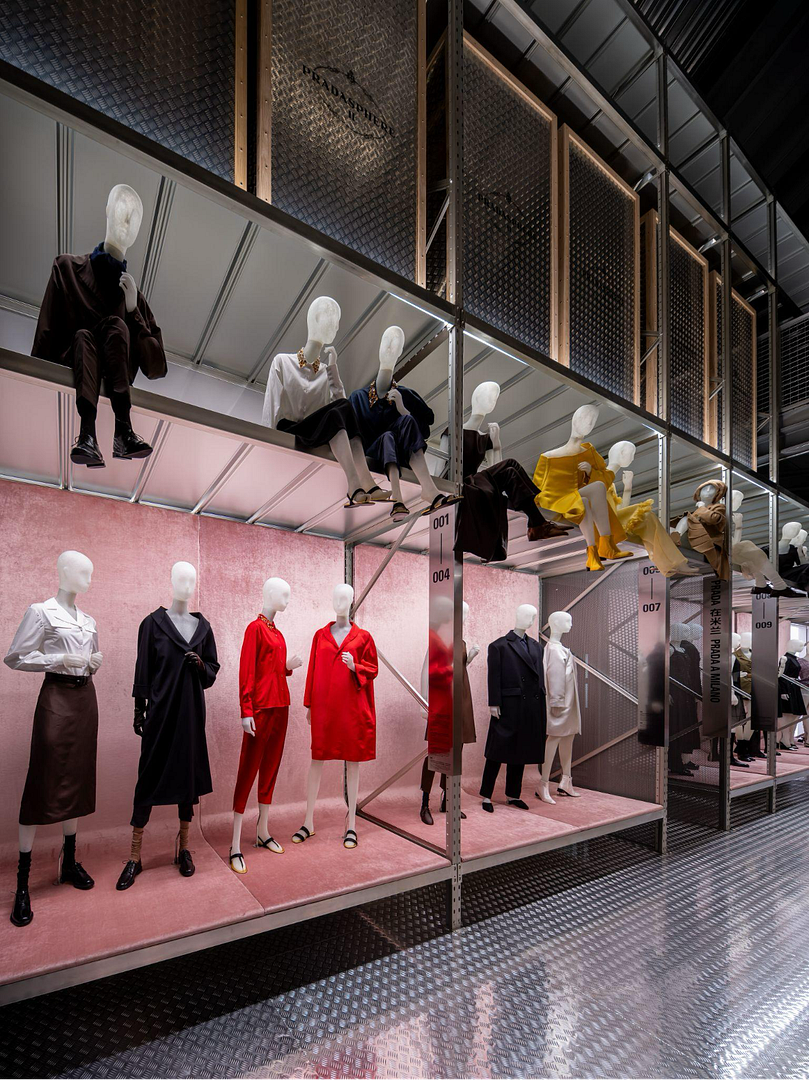
Working within a multidisciplinary team, Schmaedecke—a Brooklyn-based designer with a unique background in both architecture and graphic design—was tasked with a deceptively complex challenge: designing the environmental graphics and signage for an exhibition containing over 400 artifacts. The entire show was conceived by the Prada team and curated by co-creative directors Miuccia Prada and Raf Simons as a “magazzino” (Italian for warehouse) where the line between storage and display is deliberately blurred.
“My contribution was developing a graphic system that behaved like the storage infrastructure,” Schmaedecke explains. “Instead of introducing a new visual layer, we extended the warehouse logic into the graphic language: numbering systems, vertical category markers, bilingual labels. All were drawn from industrial conventions.”
The result was a signage system that felt inherently part of the architecture. The labels were designed as architectural components—large, assertive, and spatially integrated. They needed to be readable from across a room yet subtle enough to feel like a natural part of the industrial aesthetic.
“For most luxury brands, that restraint is counterintuitive,” Schmaedecke notes. “But this was meant to be read as a working archive, while also a spectacle. It had to be easily legible, navigable, and deliberately utilitarian.”
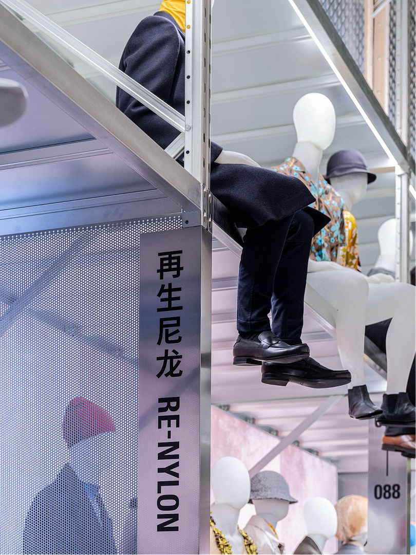
This utilitarian approach faced a significant test with the Shanghai edition of the exhibition, which required all signage to be bilingual in Chinese and English. Rather than seeing this as a complication, Schmaedecke viewed it as an opportunity to reinforce the system’s integrity.
“I think that constraint actually reinforced the systematic feel,” she says. “The numbering is universal: 001, 002, 003 read the same in any language, and that was the backbone.” For the room markers, her team arranged the bilingual text to run vertically, with Chinese and English side by side. “Chinese has an established tradition of vertical typesetting, so this orientation feels culturally and historically natural. The English, rotated 90 degrees, reads as an architectural adaptation. That tension actually works: both scripts coexist without one overpowering the other. No hierarchy between languages, just parallel information. In a way, the bilingual requirement kept the system honest.”
This approach to signage—strikingly restrained for a luxury brand—required a delicate balance between serving Prada’s established visual identity and honoring the exhibition’s core architectural concept. Schmaedecke clarifies that the core typeface and graphic language were already established; her role was the spatial application.
“In my opinion, it was visually silent enough not to overpower the show, and specific enough to feel like it belonged,” she states. This silence, she argues, is perfectly aligned with the Prada brand itself. “Prada thrives on contradiction and intellectual tension. Mrs. Prada has built a house that resists reduction.”
The true spectacle, she insists, was in the curated pieces and the immersive environment: the green velvet at the entrance, the perforated industrial steel, a Damien Hirst cabinet holding archive handbags, and a bespoke Richie Hawtin soundtrack. “With nearly 200 looks spanning decades and rooms dedicated to cinema, architecture, and sport, the pieces themselves created the spectacle. The signage just had to get out of the way and organize the density.”
This project has led Schmaedecke to a broader reflection on the power of fashion exhibition design. She admits that before joining the media agency 2×4, her knowledge of fashion houses was limited. Deep diving into Prada’s history revealed a key differentiator.
“Pradasphere is of course still strategic brand positioning. But it feels like a real cultural experience because the depth is real: Prada has genuinely invested in architecture, art, and film for decades,” she observes. “Mrs. Prada studied political science before she stepped in to take the family brand and rebuild it as she understood it should be. None of that was invented for the exhibition. It just shows what already existed. That’s the difference. Brand activations often manufacture a cultural moment to sell products. A real cultural exhibition reveals a practice built over time.”
The critical reception to Pradasphere II has been significant. The project was shortlisted for Exhibition of the Year by Frame Magazine and won an AIGA 365 Year in Design Award for Environmental/Experiential Design. For Schmaedecke, this cross-disciplinary recognition is deeply meaningful.
“It means a lot because it came from both design and architecture circles, which is exactly where my work sits,” she says. With nearly eight years at the intersection of spatial and graphic design—working on wayfinding, exhibition signage, and visual identity for cultural institutions—this cross-disciplinary foundation defines her practice.
However, Pradasphere has also marked a subtle shift in her career aspirations. “Working on this project, where every design decision served a larger brand narrative, made me realize that’s the scale I want to be thinking at,” she reveals. “I still love the craft, but I’m moving toward brand positioning, creative direction—the kind of thinking that shapes what a project becomes before anyone touches a wall or a typeface.”
By Margaret Wright
Published February 26, 2026
Images courtesy of 2×4.