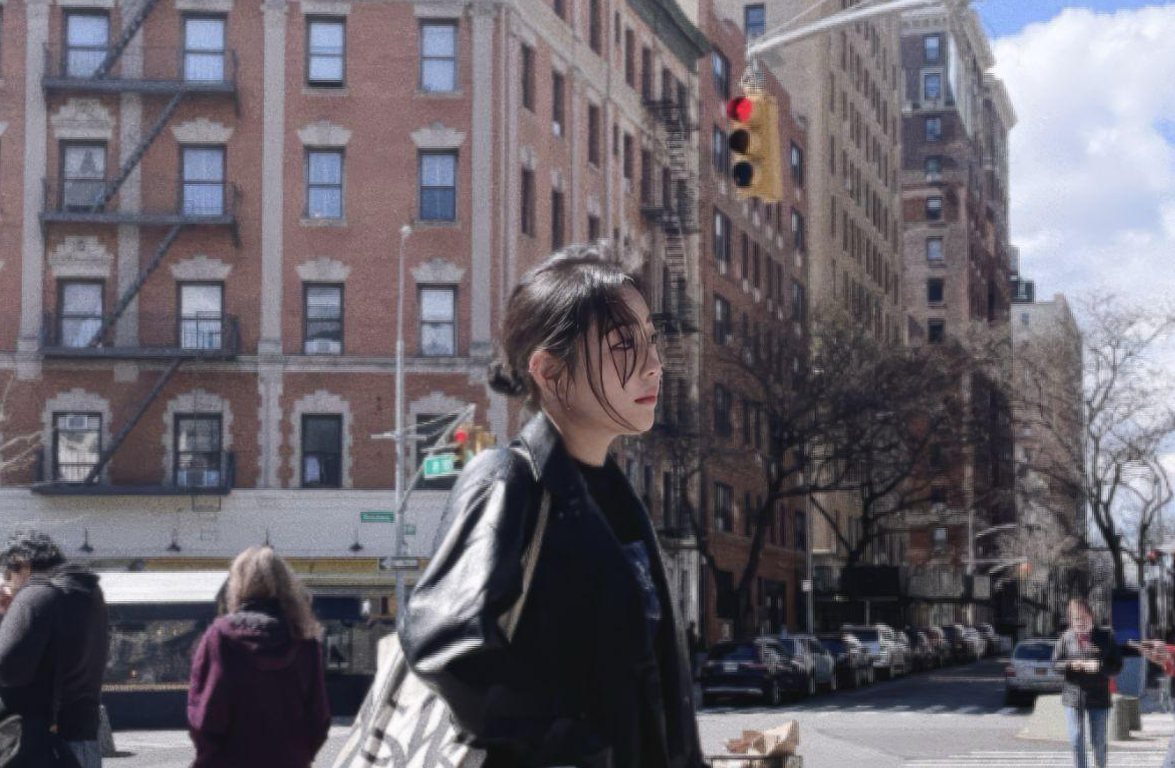
In the polished, often cynical world of New York advertising, “authenticity” is a word that gets repeated until it loses its meaning. Brands want to be “real,” yet often end up feeling like algorithms dressed in casual clothing, polished, predictive, and hollow. Then you meet Woojung Lee, and you’re reminded what authenticity actually looks like.
With a portfolio spanning everything from a lighthearted zoo campaign to critical societal topics like climate change and the complexities of inclusive design, this art director offers a diverse creative range. Woojung is emerging as a distinct voice in New York’s creative scene. But she isn’t interested in making work that simply looks “cool.” She’s interested in making work that feels like a friend, honest, observant, and quietly supportive.
Born in South Korea, transplanted to the Washington, D.C. area at age 20, and later moving to New York City to pursue her creative ambitions, Lee has navigated language and culture to form a design philosophy rooted in empathy. Even her name reflects that approach. “Woojung” translates to “friendship” in Korean, a meaning that evolved from a childhood curiosity into a professional compass.
We sat down with the Fashion Institute of Technology graduate to talk about her journey, why she believes brands need to stop shouting, and how binge-watching Friends taught her more than just English.
The Interview
1883: Your name comes up often in conversations about your work. Why does it matter so much to you?
Woojung Lee: My name literally means “friendship” in Korean, and growing up that felt like a lot to live up to. [Laughs] But once I started working in advertising, it became a guiding principle.
In this industry, we talk about “target audiences,” which already sounds aggressive. People become numbers, demographics, and conversion rates. When I reframed my thinking around friendship, everything changed. You don’t target a friend—you listen to them. You try to understand what they’re dealing with and offer something helpful or comforting.
Now, when I get a brief, I don’t ask, “How do we sell this?” I ask, “How would a good friend handle this conversation?” A friend doesn’t shout. They relate. That shift removes ego from the work and brings humanity back in.
1883: You moved to the U.S. alone at 20. How did that experience shape your visual language?
WL: It was both terrifying and exciting. When you don’t speak the language fluently, you become incredibly observant. You read body language, tone, color, and context just to function day to day.
That’s why I gravitated toward art direction. Before I could fully express myself in English, I could communicate through images. Visual language is universal. If I design something with frantic red typography, you immediately feel urgency, regardless of language.
My work became very emotive because design was bridging a gap language couldn’t yet cover. I learned to trust the emotional truth of an image over a long explanation.
1883: There’s a well-known story about Friends helping you learn English. True?
WL: Absolutely true. I might sound a little cliché; I completely binge-watched Friends right after I arrived. That’s actually why people sometimes tell me I sound like Phoebe.
But the show offered more than just language lessons; it was a masterclass in American culture, covering how people navigate conflict, humor, and vulnerability. I internalized that Americans appreciate directness coupled with warmth. They have a strong desire for community and to feel truly acknowledged.
This core understanding continues to inform my professional work. I’m always aiming to capture that “Central Perk” dynamic in every campaign—a feeling of easy, shared connection. Even when tackling complicated subjects, I want the brand to feel like that trusted, sixth friend sitting on the couch. Incidentally, my interest in advertising was sparked by Chandler, though I won’t give away any spoilers for those who still haven’t seen the series.
1883: Your portfolio tackles heavy topics like climate change. Why lean into discomfort?
WL: Because that’s what real friends do. They don’t just tell you what you want to hear.
With Mother Nature Is in Menopause, I wanted to break the silence around climate change. The conversation has become so clinical, charts and data points. It’s easy to ignore a graph. I wanted to make the issue bodily and visceral.
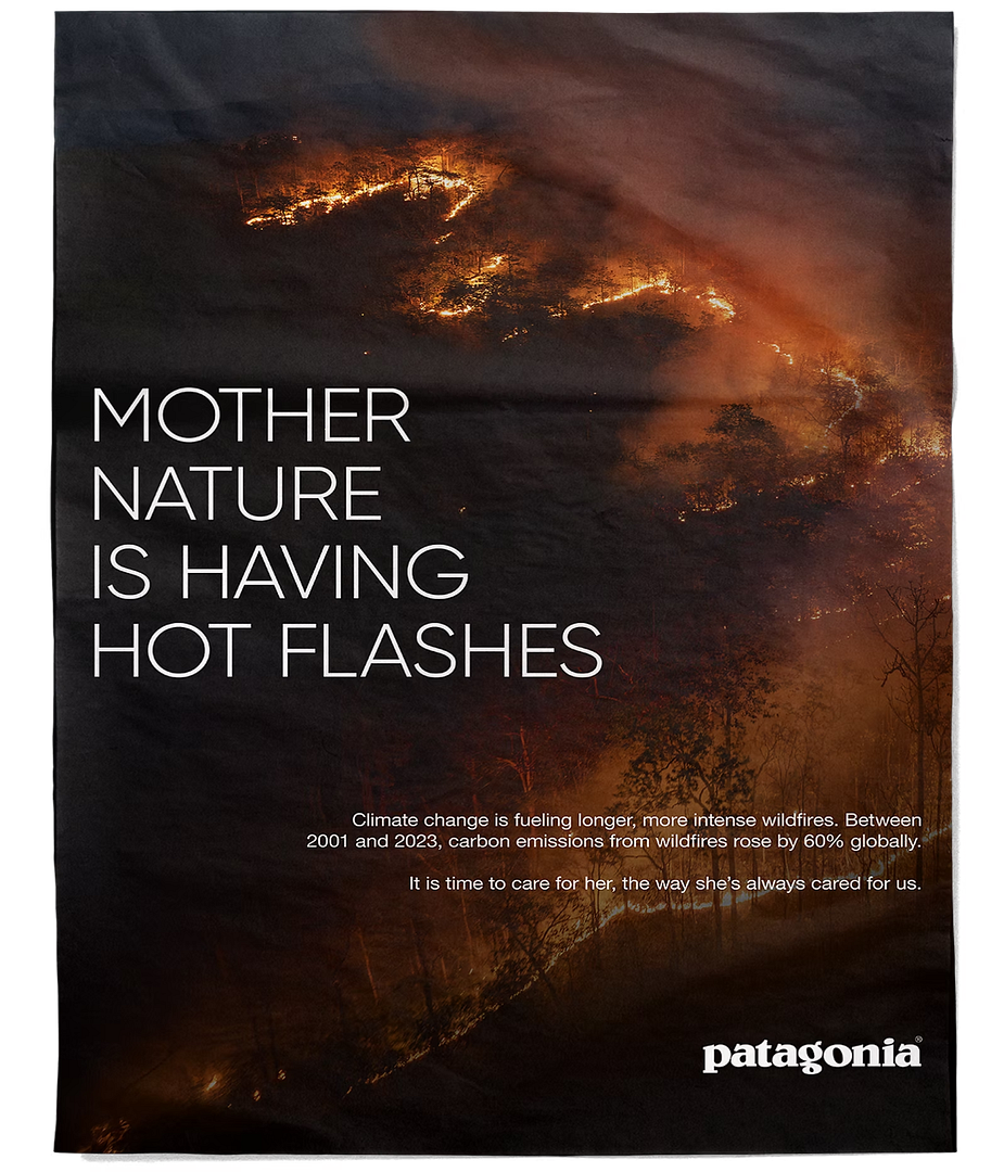
Menopause is a transition people understand as real and uncomfortable, yet often ignored, much like climate change. Combining the two creates friction that forces attention. It’s risky, but safe work disappears. If I’m not making you feel something, even discomfort, then I’m just adding to the noise.
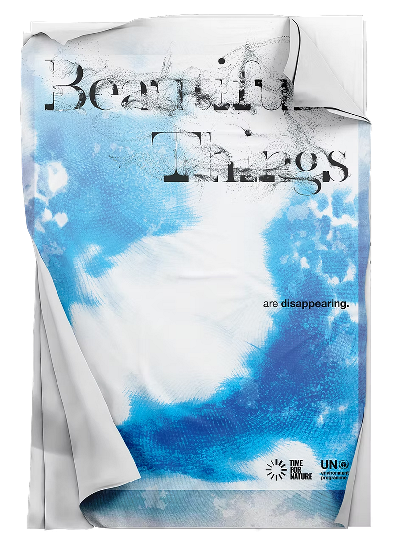
Disappearing Beautiful Nature: A Speculative Poster Design using Greta typeface for UNEP
The same thinking applies to the Greta project. It speaks like a friend who tells the hard truth: the place we’re living is becoming uninhabitable. And if that’s the reality, we have to ask ourselves what are we doing with all this money, progress, and growth if it isn’t being used to protect the world we live in?
1883: You’re also developing a project called Rabbit Hole. What’s the idea behind it?
WL: I was watching Love on the Spectrum on Netflix, and I was struck by the depth of focus people had around their interests, the level of knowledge, care, and expertise they developed. It made me question why we so often see that intensity as something that needs to be limited or corrected to fit into a standard curriculum.
The phrase “going down a rabbit hole” is usually framed as a distraction, but for many people, especially those on the autism spectrum, that’s actually how learning happens. Curiosity doesn’t move in straight lines; it deepens, tunnels, and connects.
Rabbit Hole explores how Google Gemini, a multimodal AI system, can support that kind of learning rather than suppress it, using technology to expand curiosity instead of capping it. To me, that’s what inclusive design really means: not forcing people to adapt to systems, but designing systems that adapt to people. Technology, used with empathy.
1883: With AI changing the industry, where does the art director fit now?
WL: AI is incredible at optimization, but it can’t empathize. I don’t know what it feels like to be lonely in a new city or nostalgic about childhood.
AI can mimic friendliness, but it can’t be a friend. I think art directors are becoming curators of humanity, injecting emotion, imperfection, and intuition into machine-generated possibilities. As things get more polished, people will crave honesty even more.
1883: What’s the ultimate goal for you?
WL: My goal is to join a creative studio that values radical empathy and diverse perspectives. A place where every project begins with a simple, profound check: “Is this kind? Is this honest? Is this helpful?” Ultimately, I want to contribute to a warmer world, fostering love and connection through my work.
1883: One final piece of advice for young creatives moving to New York?
WL: Prioritize cultural integration: understand the local culture and actively participate in it. This foundation of empathy is your most significant asset, allowing you to introduce your unique perspectives and experiences effectively so that they truly resonate with others. You don’t need to imitate, but you must connect.
Embrace your full self, your accent, your background, your obsessions. New York doesn’t need people who simply fit in; it needs people who bring a distinct vision.
Conclusion
In an industry driven by speed and scale, Woojung Lee offers a quieter philosophy: that the most powerful creative work behaves like a friend. It listens before it speaks, tells the truth without cruelty, and shows up consistently.
As advertising evolves alongside technology, Lee’s work reminds us that empathy isn’t a soft skill, it’s a competitive advantage. In a world full of noise, friendship may be the most radical creative strategy of all.