
The most enduring brand worlds don’t usually show how much thought went into building them. They feel whole, with a clear sense that people can step into them without really noticing the choices that shape the experience. For Tianyi Xie, that unseen craft is where brand equity gets built. Not overnight, but through years of consistent choices that make a brand instantly recognizable long after any single campaign ends. Her focus has been building a visual world for brands that is grounded in a clear idea, distinct design choices and a cohesive look and feel across touchpoints.
Building a Visual World, Not Just an Ad
Tianyi Xie is a senior art director at BBDO Chicago, and she works on both global and national projects for companies like Brown-Forman, Bayer, and Mars Wrigley. Her work combines big-picture campaign ideas with detailed visual stories, translating a campaign’s main strategy to the visual choices that shape how people experience it. One idea has to expand across areas like commercials, social media, OOH billboards, print spreads, store shelves, and physical activations, but it should stay the same and not change its main message. For Xie, art direction isn’t just about improving individual elements, but about building a visual structure that can keep everything unified as it grows.
The process begins with the fundamental language of design. Typeface, color, layout, graphic elements, and photography all help establish how a campaign should look and feel.
The same logic follows through to production. Director selection, treatment, set design, wardrobe, and prop styling can all influence whether the final execution feels connected to the original concept.
What ties those decisions together is the idea at the center of the campaign. “When all visual storytelling matches, the campaign idea holds together wherever people run into it,” Xie says.
Two Extra projects illustrate how that approach can take very different forms, depending on the creative problem being solved.
From Character to Campaign Universe
Extra’s “Chew Into It” platform centers on Chewbert, a mascot designed to resemble a piece of chewed gum, built to support the campaign’s idea of helping people stay present in the moment. A mascot without a defined world to live in goes stale fast, so Xie developed Chewbert’s character design and personality from sketch to screen, directing Psyop Media on tactile texture, movement, and physical presence.
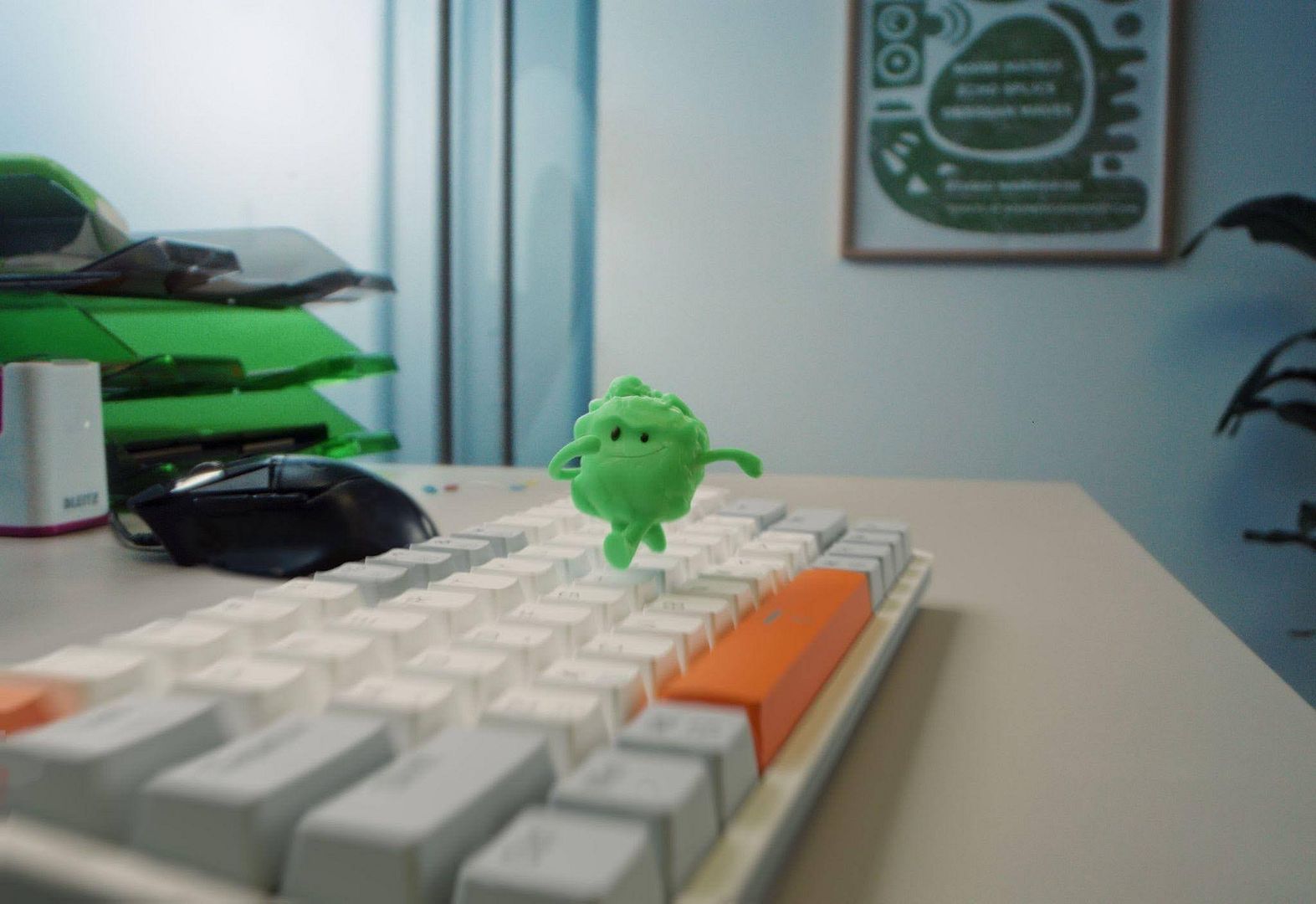
Consistency is what turns a character into brand equity rather than a one-off gimmick. Xie authored the design guidelines establishing rules for Chewbert’s anatomy, visual consistency, and interaction with the world around him, then applied those rules across more than 20 television and social assets, packaging, Amazon storefronts, and large-scale murals in New York and Los Angeles. The platform’s staying power showed up beyond the brand’s own channels too: Ad Age selected it for its “Creative Ads of Today” roundup, with DesignRush and Ads of the World both publishing deep dives on its resonance with Gen Z audiences.
Making “Extra Time” Feel Like Its Own Era
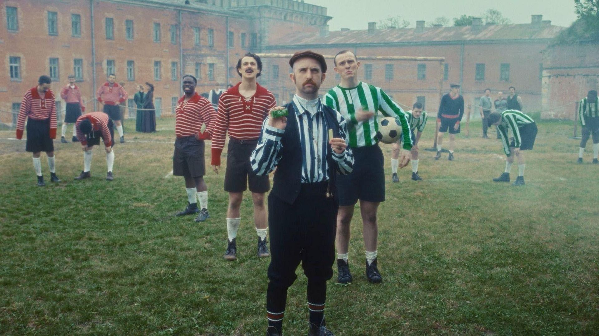
World-building looks different again when the task is period recreation rather than character design. Extra was not an official sponsor of the 2026 World Cup, but “The Birth of Extra Time” claimed a piece of the tournament anyway, built on a detail already written into the rules of the game. When a match is tied at 90 minutes, it goes into extra time, and that gave Xie’s team an opening to invent a fictional origin story: an early-1900s tale of how the rule came to be.
For the joke to land, the era had to feel real. Xie rooted the aesthetic in “modern vintage” realism, drawing from archival sports photography down to lace-up jersey collars, striped wool knits, worn leather boots, brass referee whistles, and wooden scoreboards. That production design paired with deliberate period-film framing and dry humor, trading the familiar language of a modern stadium for something closer to an artisanal short film.
The world extended past the main spot into custom social cutdowns and the original campaign anthem “Hotshot (Extra Time).” The results measured the payoff of that consistency: over 1.3 million long-form views, more than 17.4 million views across paid social cutdowns, and enough cultural traction to draw coverage from Shots News, Little Black Book, Ads of the World, and mainstream outlets including OK! Magazine and Hit Parader, plus a soundtrack that kept streaming through the tournament.
Applying the Same Thinking Beyond Big Campaigns
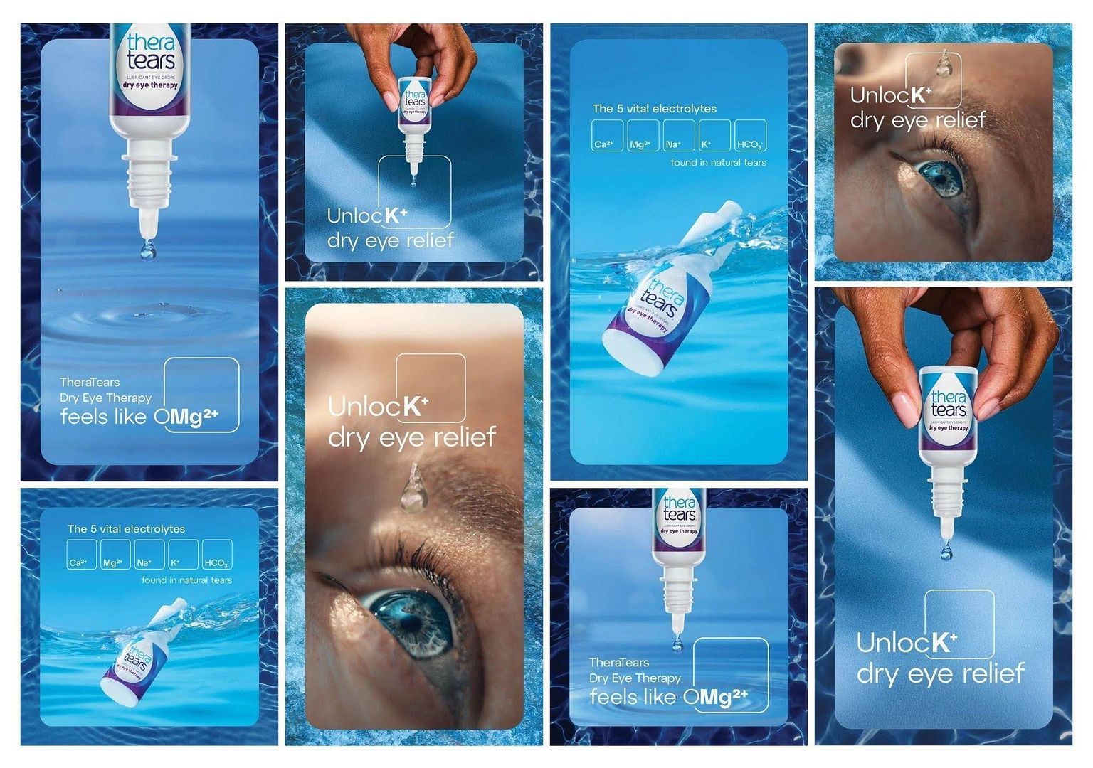
The same principle scales down just as deliberately in TheraTears’ “Science-Backed Hydration” campaign, a national DTC platform Xie led. Rather than separating the scientific claim from the visual identity, she conceptualized the use of periodic table elements to represent the formulation’s key ingredients, building the entire campaign around that single idea. It is a smaller canvas than a mascot or a World Cup stunt, but the discipline behind it is identical: find the idea that can hold the whole campaign together, then let every visual choice answer to it.
The Art Director as World Builder
Across all three projects, the sequence stays the same. A concept simple enough to steer every choice that follows. Then that idea takes physical form through typography, palettes, and photography. Then production tests it under real conditions: casting a director, styling a set, dialing in a camera angle. When each step still answers to the original idea, what’s left behind is not just a successful campaign, but a visual memory that outlasts it, one that shows up again in the next brief, the next media cycle, the next year’s numbers.
“A campaign can’t just occupy media space. It has to inhabit an atmosphere,” Xie says. That is the difference between an ad people scroll past and a brand world people carry with them, and it is where the equity actually lives.
By: Rahul Chopra