
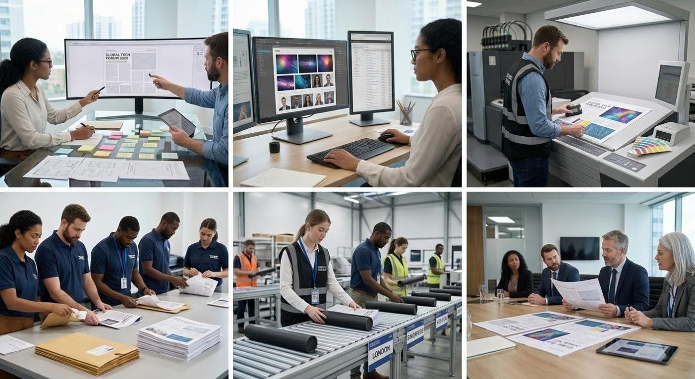
Designing a professional broadsheet for a corporate event is far more than simply arranging text and images on a large sheet of paper. It is a considered exercise in corporate communication, requiring an understanding of your audience, your event’s objectives, and the visual language of your brand. When done well, a broadsheet becomes a powerful piece of event branding that guests genuinely engage with — before, during, and long after the occasion.
In brief
- Designing a professional broadsheet for corporate events requires a strategic balance between audience insight, clear objectives, and consistent brand identity.
- Establishing a strong visual foundation through grid systems and typography is essential for ensuring professional readability and structural organization.
- Effective broadsheet design prioritizes the use of white space to prevent overcrowding and to guide the reader’s focus toward key information.
- High-quality, purposeful imagery should be selected to reinforce brand messaging rather than acting as mere filler content.
- Content should be written in a narrative format that aligns with the event’s specific goals, avoiding unnecessary jargon to improve guest engagement.
- Strategic use of visual hierarchy, including section headers and calls to action, helps direct the reader’s experience and encourages post-event interaction.
Planning the Layout and Visual Structure of Your Corporate Broadsheet
Before a single headline is written or photograph selected, the structural foundations of your broadsheet must be firmly in place. A well-considered approach to event layout planning will determine how readers navigate the page and how much of your message they actually absorb. A reliable platform for broadsheet printing like printnewspaper.com offers a broadsheet size of 332 x 475 mm with a sheet size of 664 x 475 mm, printed on 60gsm paper using an eco-friendly process with water-based inks — details worth factoring in from the outset of your design.
Choosing the Right Format, Grid System and Typography for a Polished Look
The grid system is the invisible architecture that underpins every great broadsheet. For corporate contexts, a multi-column grid lends a structured, editorial feel whilst allowing flexibility for varying content types. Typography choices must strike a balance between authority and readability: a clean serif for headlines conveys gravitas, whilst a well-spaced sans-serif body font ensures the text remains accessible across all ages and reading environments. Custom newspaper printing services often provide templates tailored to corporate themes, which can serve as an excellent starting point before bespoke adjustments are made.
Balancing white space, imagery and brand identity across every column
One of the most common missteps in event design strategy is overloading a broadsheet with content in an attempt to maximise the space. White space is not wasted space — it is a design tool that allows key messages to breathe and guides the reader’s eye to what matters most. Imagery should be chosen to reinforce your event branding, not merely to fill gaps. Subtle, consistent use of brand colours throughout columns, headers, and dividing rules creates a cohesive visual identity without tipping into the territory of overwhelming the reader with corporate messaging.
Crafting content that engages and informs your corporate audience
Thoughtful design alone cannot carry a broadsheet. The copy must be purposeful, clear, and reflective of the event’s core objectives — whether the aim is to educate attendees, celebrate achievements, launch a product, or strengthen professional relationships. Understanding the nature of corporate event planning means recognising that different events demand different tonal registers, and your broadsheet content should mirror that distinction precisely.
Writing clear, purposeful copy that reflects your event’s key messages
Every section of your broadsheet should serve a defined purpose. Editorial copy that articulates the event’s vision, profiles key speakers, or unpacks the significance of a product launch adds genuine value for the reader. Marketing materials of this kind benefit enormously from a narrative structure rather than a series of bullet points — readers are drawn into a story, and a broadsheet format naturally accommodates longer-form prose that holds attention. Keep sentences varied in rhythm, avoid jargon where simpler language will do, and always write with the guest experience in mind.
Organising Sections and Calls to Action to Guide Readers Effectively
A well-organised broadsheet uses visual hierarchy to help readers understand where to look and what to do next. Section headers, pull quotes, and strategically placed calls to action create a natural flow through the publication. For corporate events, this might mean a prominent welcome message from a senior figure, followed by a programme overview, and concluding with networking prompts or information about post-event follow-up. Event engagement can be meaningfully extended through printed materials that guests take home, so ensuring the content has lasting relevance is well worth the additional editorial effort. Whether you opt for tabloid printing or a full broadsheet format, the underlying principles of clarity, purpose, and brand consistency remain the same — and the investment in a professionally produced newspaper is one that pays dividends in the perception of your event long after the day itself.