Source: Unsplash
For a fashion brand, image is everything. Not because fashion is shallow (it’s not), but because of human psychology: buyers, editors, and customers decide whether to trust you in seconds. Mere seconds.
And trust? It comes from clarity. The brand needs to know exactly who they are, and that knowledge needs to show everywhere. In the logo and the clothes, of course, but also in the hangtag paper, the tone of a press email, the thickness of a lookbook cover… All of it.
Enter the brand book, one of the best tools for building that visual identity. It works particularly well today when most branding is digital, precisely because the book isn’t. People can actually touch it, and that’s no small thing today. Itmakes a brand stand out as it gives it more weight.
So below, we break down what actually belongs in a fashion brand book, and how to use it as an actualy working tool, not a branding artifact that does nothing but sit untouched.
What a Brand Book Means in Fashion and Beauty
A brand book for fashion or beauty is not a mood board with rules slapped on later. It’s a working document that defines how your brand speaks, looks, prints, and shows up in physical space.
And yes, digital matters. But fashion still lives in fabric, paper, packaging, and rooms. It’s good to remember that when you’re brainstorming marketing ideas.
Another crucial thing to remember, your north star if you will, is consistency. Research shows that brands that maintain consistent presentation see revenue increases of up to 33%. So, if you think consistency sounds boring, look at it from a different perspective: it’s the base that allows for experimentation without brand dilution.
Making An Effective Brand Book for Fashion
An effective brand book doesn’t explain your brand to you, but it makes your decisions easier for everyone else. It turns taste and what you stand for into systems and repeatable choices, so the brand holds together as it grows. Get the following things right, and you’ll nail clarity and identity.
Voice
Voice guidelines clarify tone across campaigns, product copy, lookbooks, press releases, and even internal decks. Are you sharp and concise, or warm but precise? Do you use humor sparingly or never at all (important distinction)?
Nailing the voice is essential, and it also saves time later. It stops endless rewrites and prevents collaborators from projecting their own voice onto your brand (which does happen otherwise).
Typography
Typography rules often feel restrictive until you see what happens without them. A strong brand book defines primary and secondary typefaces, hierarchy rules, spacing, and misuse examples.
For fashion brands, typography carries as much weight as silhouette. Serif choices, tracking, and contrast ratios subtly signal luxury, accessibility, or edge. When retail signage, swing tags, and editorial layouts align, that’s the identity we talked about in the intro. When you achive this, your brand will finally read as intentional instead of improvised.
Color
Color systems in fashion brand books go beyond “brand colors.” You define primary palettes, seasonal extensions, neutrals, and contrast usage. You also document what not to do (which is almost equally important).
Pantone alignment and CMYK/RGB breakdowns reduce production errors and vendor confusion. And they keep your black from turning charcoal in print (a common and expensive mistake).
Photography Direction
Photography guidelines clarify composition, cropping, lighting, model energy, and background treatment. This matters whether you shoot a campaign or a last-minute e-commerce update.
A strong direction lets multiple photographers produce work that feels cohesive. Vogue Business reports that visual consistency improves brand recognition across global markets, especially for emerging labels scaling quickly.
Packaging Specs and Print Standards
Packaging guidelines outline materials, finishes, tolerances, and construction. So things like paper weight, coatings, emboss depth, foil behavior, and structural integrity. If you botch this, you lose polish.
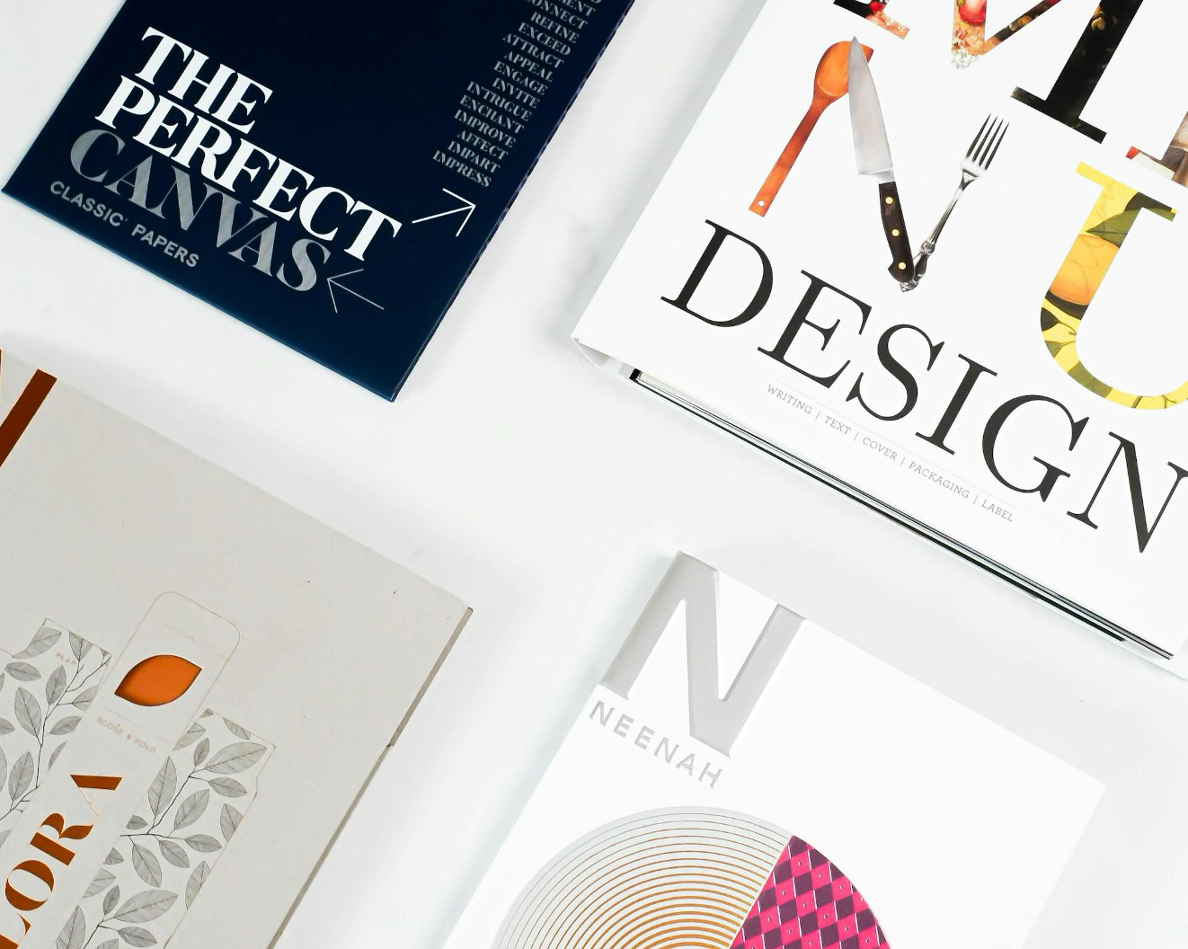
Print standards explain execution, not aesthetics. You document substrates, binding styles, color proofs, and finishing techniques. If all this sounds too complicated, it’s best to work with professionals like Print. You can contact print-newyork.com to get these details right, as well as check out their brand book examples for inspiration.
Why a Physical Brand Book Still Matters
Digital PDFs travel fast. That’s their benefit but also downside. Physical brand books, on the other hand, are “slower” and therefore communicate authority. When runway teams, retail associates, stylists, and collaborators can touch the brand, alignment improves.
A printed book also signals seriousness. It tells partners you plan to exist next season and the one after that. In an industry where perception equals credibility, it’s a signal that carries weight.
A Simple Workflow for Emerging Labels
So, how do you start? You start small but deliberate.
Define your core voice, typography, and color system first. Then lock photography direction and packaging standards before expanding.
And treat the brand book as a living document. Update it as the brand evolves, but never retroactively to justify inconsistency. And print at least one physical version early. It forces clarity and exposes weak decisions.
And remember, a brand book doesn’t limit creativity. It gives you room to push boundaries without losing yourself in the process. And in fashion, that balance is the difference between a moment and a brand.