The graphic design landscape continues to evolve as designers increasingly explore approaches that emphasize individuality, materiality, and experimentation. Amid these shifts,
Czech graphic designer Tomáš Hlava has developed a practice rooted in storytelling, investigation, and close observation.
Rather than adhering to a fixed visual approach, Tomáš develops forms that respond to the particular context of each project, ranging from publications and visual identities to exhibitions, writing, and type design. Across these different formats, graphic design serves as a means of communicating stories and revealing relationships between seemingly unrelated subjects.
“As a graphic designer, I am interested mostly in storytelling, either through graphic design or typography,” says Tomáš. “Although I often draw those letters and sometimes typefaces, I don’t really consider myself a type designer. Instead, I am interested in where typefaces come from, what they represent, and how they can be used to communicate ideas, tell stories and inform the design process.”
Alongside independent projects, he works professionally as a designer for agencies, cultural institutions, and universities in both Europe and the United States. We caught up with Tomáš to discuss his design philosophy, his investigative project Have You Seen Amelia? at Berlin’s LOOM gallery, his upcoming teaching workshop at the China Academy of Art and how he translates complex human contexts into visual forms.
The Architecture of Context
Tomáš’s journey reflects a commitment to exploring the intersection of creativity, design and communication. His educational background spans three institutions with distinct legacies in design history: VOŠ Scholastika in Prague, Czech Republic, the Gerrit Rietveld Academie in Amsterdam, the Netherlands, and the Yale School of Art in New Haven, United States.
This cross-cultural education helped shape an approach that prioritizes context and meaning over aesthetics alone. When beginning a project, Tomáš often looks for a specific point of departure—whether an idea, a typeface, a story, a material, or a historical reference—that can guide the design process.
“This is often already defined by the context of the project—and there is always some context that is given. I believe the form should be as specific as possible to a particular project, so specific that you cannot simply take it and apply it somewhere else, on a different project,” he adds. “I believe that if you can simply take it and apply it elsewhere, the designs easily become formulaic and I am really trying to avoid that.”
For Tomáš, successful design is an act of excavation rather than arbitrary creation. He approaches a new brief less as a blank canvas and more as a question waiting to reveal its own solution. “In a way, I am looking for answers—and those are often already in the question,” he said. “For me, the question is the content and the context, while the answer is the form. By spending time with the context of the project I am working on, certain formal gestures always suggest themselves. My approach is always to choose one or two of those formal gestures and work with them, preferably only one. I am not a fan of combining many, as I believe it often weakens the design as a whole.”
Typeface as a Carrier
This philosophy transforms typography from a mere layout utility into a primary storytelling device. Typefaces are not chosen solely for legibility; they also carry histories, associations, and cultural meanings that can shape how a project is understood.
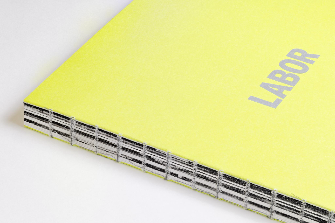
A recent example is Tomáš’s book design for New York–based photographer Alexander Laurent Rubalcava’s latest publication, Labor. As part of The Art of Building program, the photographer spent over a year documenting construction workers, infrastructure projects, and manufacturing sites within the portfolio of Clark Construction and the 1906 Group; one of the largest infrastructure contractors in the United States.
When developing the publication, a typeface called Interstate immediately came to Tomáš’s mind. It was initially designed by Tobias Frere-Jones and is based on the Highway Gothic typeface. The lettering system was originally developed for the American highway network in the late 1940s and is still widely used today. “The typeface represented several important aspects of the project: travel, connection, construction and domestic landscape,” he says. “We ended up using Interstate throughout the publication, carrying those ideas from the very beginning to the very end of the book.”
The project reflects a way of thinking that appears throughout Tomáš’s work. Rather than selecting a typeface based solely on its appearance, he is often interested in what a typeface represents, where it came from, and whether its histories and associations can contribute something meaningful to the project itself.
Subconscious Navigation and the Single Gesture
Tomáš’s versatility as a designer is as varied as his work experience. He worked as a Graphic Designer at the Yale Center for Collaborative Arts & Media (CCAM), collaborated with high-profile creative agencies including Lemon Inc. and Something Special Studios, and has worked on large-scale commercial projects in New York City.
To Tomáš, designing for the chaotic sensory landscape of downtown Manhattan, requires a completely different relationship with the viewer than designing a monograph.
“I think that in those environments, it is often more important to help people move through a space, rather than stop them,” Tomáš says. “Most of the time, this works almost subconsciously. People probably don’t remember every graphic, sign, or display they encounter, but they still navigate according to them.”
The role of design, in this context, is often less about attracting attention and more about creating clarity. When visibility becomes necessary, however, Tomáš generally favors simple and direct gestures that can be understood quickly within a busy environment.
That preference for reduction rather than accumulation appears repeatedly throughout Tomáš’s work. Whether designing a publication, a poster, or a retail environment, he tends to focus on a small number of formal decisions and develop them consistently rather than layering multiple ideas on top of one another.
Recognition in Glasgow
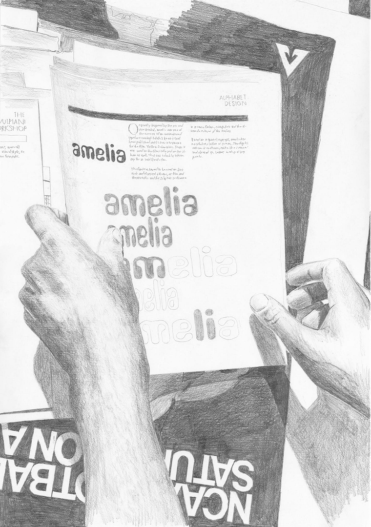
This way of working has also been recognized through international exhibitions and competitions. At the INTL International Poster Competition in Glasgow, his works Dear Amelia and Yale Norfolk School of Art were selected for the final exhibition—placing in the top 80 out of more than 2,200 global submissions.
“What made the selection meaningful to me was that the two posters came from very different projects, yet both represent a way of working and thinking that is important to me,” Tomáš says. “For one of the posters, I spent months redrawing a series of my photographs by hand. Obviously, for a lot of people the project is a project about drawings—to me, it has never been so much about that, as it has been about other ideas that the project suggests. It’s also about the principle of talking about something without really talking about it at the same time.”
While the two posters emerged from very different contexts, both reflect an approach that runs throughout Tomáš’s work: beginning with a specific subject and allowing it to determine the form the project eventually takes.
Have you Seen Amelia?
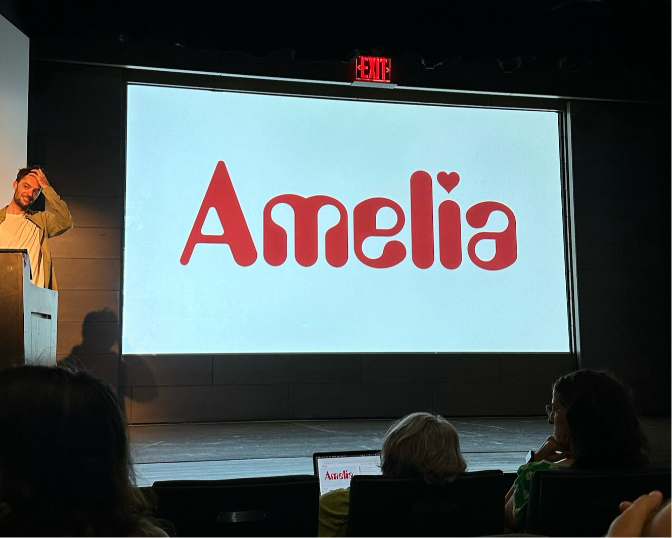
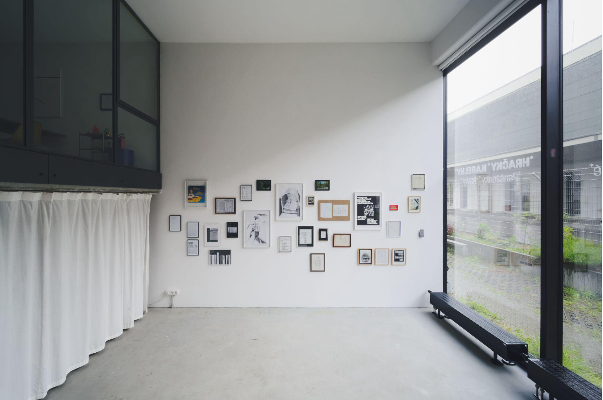
That process of following a specific subject wherever it leads has perhaps found its most extensive expression in Have You Seen Amelia?, currently on view at LOOM in Berlin, a Berlin gallery founded by designer Na Kim.
The exhibition emerged naturally from Dear Amelia, an ongoing project Tomáš has been developing since 2022. What began as an interest in a typeface called Amelia, designed by American designer Stanley Davis in the 1960s, gradually expanded into a broader investigation into the histories and mysteries surrounding it.
Tomáš describes the project as beginning with a curiosity about the typeface Amelia before gradually expanding into an investigation of the stories, controversies, and unanswered questions connected to it, including issues of plagiarism and its appearance on The Beatles’ Yellow Submarine album.
For several years, the project existed primarily through writing and public presentations. Tomáš presented versions of the Dear Amelia talk at Cooper Union’s Herb Lubalin Lecture Series in New York City, the ATypI conference in Copenhagen, Other Means in New York City, and the Typography: Theory & Practice conference in Leeds, UK.
The exhibition at LOOM marks the first time the project has taken a physical form. It brings together original research materials, printed matter, photographs, and artifacts collected throughout the investigation, offering visitors insight into the process of uncovering the story itself.
“Obviously, the project is about a typeface, but to me it has always been more about things like history, absurdity, obsession, or human relationships.”
Teaching Through Content
Many of the ideas that shape Tomáš’s design work also inform his approach to teaching. Having previously run experimental typography workshops like From A to Z at Yale CCAM, he is now preparing to lead a three-week intensive workshop at the China Academy of Art in Hangzhou, China.
Rather than beginning with a conventional design brief, the workshop starts with a single Chinese word assigned individually to each student. From that starting point, students investigate the word’s meanings, histories, associations, and contradictions through research, writing, discussion, and a series of formal exercises involving typography, publication-making, and moving image.
What interests Tomáš most about the structure is the reversal of expertise that it creates. “What I like about this structure is that the students immediately become experts of their content. Since I do not speak Chinese, I am unable to understand the words they will be working with—the workshop asks students to explain and introduce their words to me through those formal exercises.”
For Tomáš, the workshop reflects a broader belief that students often learn design most effectively when working with subjects they already have a personal relationship to. The workshop will culminate in a series of publications and other outcomes developed from the students’ individual investigations.
When asked why, in an era dominated by digital media and interactive UI, he continues to center publication-making within his teaching, Tomáš points to the unique way books bring together many of the discipline’s core elements. Although publications may no longer occupy the same central role they once did, he continues to see them as one of the most effective frameworks through which graphic design can be taught and learned.
“A publication or a book brings together many of the fundamental elements of the discipline: typography, layout, scale, sequence, image, materiality, size, weight, and structure. It allows students to think about how all of these elements relate to one another and how ideas can be communicated.”
Whether designing a publication, developing an exhibition, creating a visual identity, or teaching a workshop, Tomáš’s work repeatedly returns to the relationship between content and form. Rather than imposing solutions onto a project, his practice is built around paying close attention to the material already present and allowing it to guide the outcome.
Words Nadja Sayej
Images courtesy of Tomáš Hlava, Xinyuan Qu, Alexander Laurent Rubalcava and Siniz Kim (LOOM Berlin)